VR/AR Design
XR Training System
Interactive VR/AR training system for hands-on assembly skills.
Year :
2023
Role :
UX/3D Designer
Tool :
Figma, Maya
Project Duration :
3 months
Impact :
I redesigned an XR training system used in high-stakes technical environments, improving clarity between training and exam modes and streamlining the onboarding process.
CONTEXT & PROBLEM :
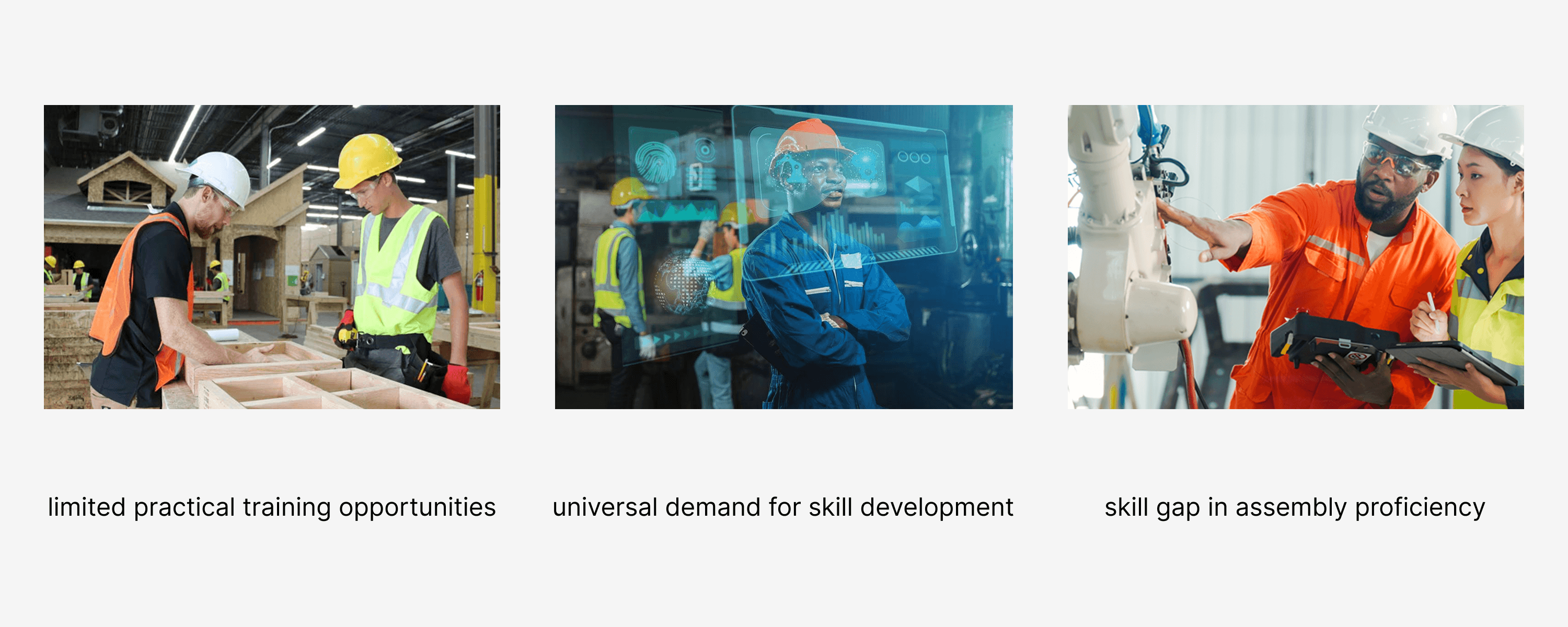
Across industries, there's a growing demand for practical assembly skills, yet limited opportunities for hands-on training. Our goal was to build a system that transforms static learning into experiential, repeatable practice—accessible anytime, anywhere.
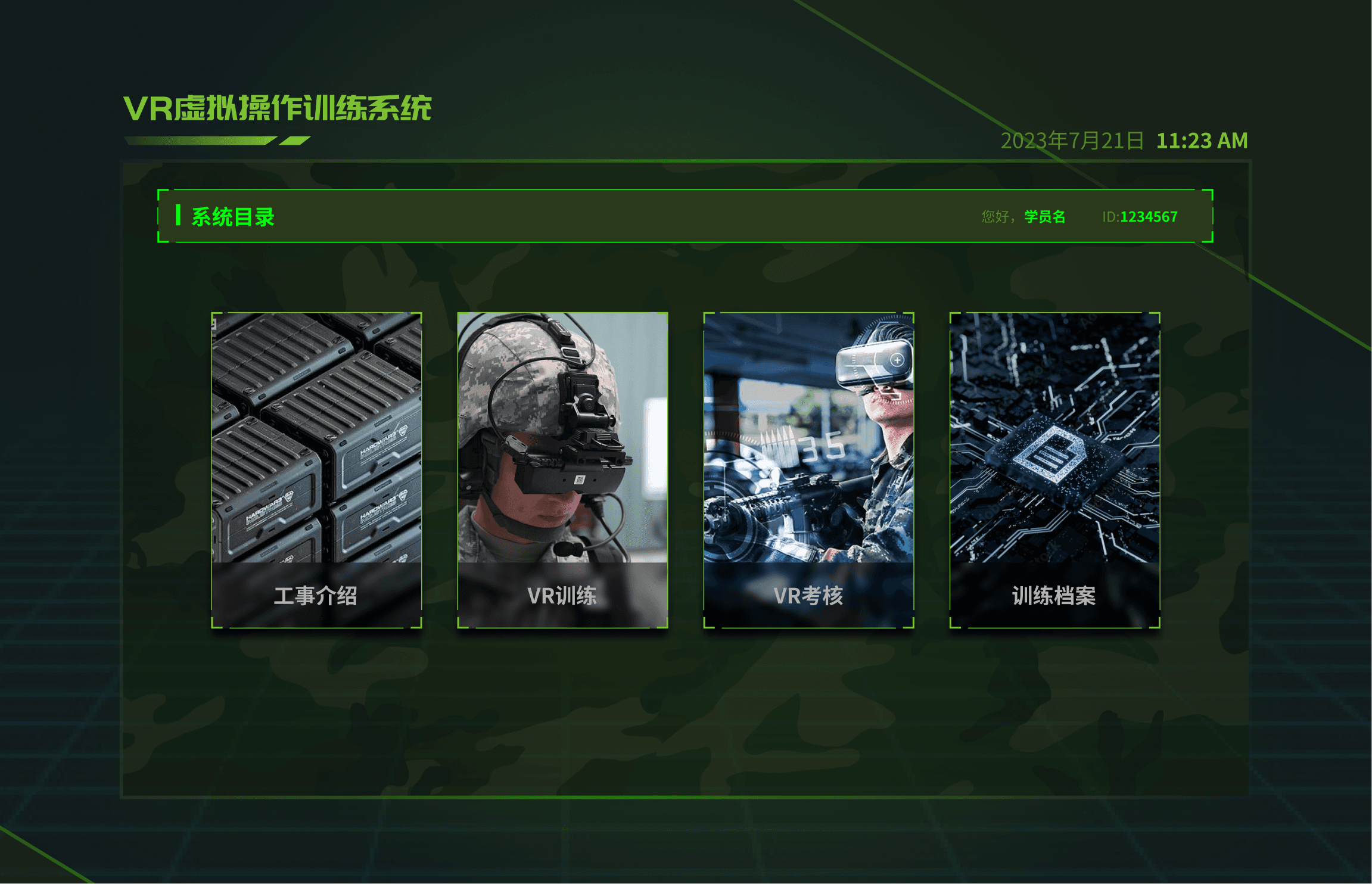
The XR training platform was designed to help trainees learn complex procedures through immersive VR and AR environments.
However, user feedback and test results revealed three critical issues shown below.
Challenge: Redesign the system to be intuitive for first-time users, while preserving advanced functionality for experienced operators.

Constraints:
Project timeline: 3 months
Proprietary product: limited visual disclosure without NDA
Multi-platform design: VR headset + desktop

My Role & Responsibilities :
My role: UX designer, 3D modeler, 3D animator
Team: 1 product manager, 4 developers (Unity), 1 QA lead, 1 subject matter expert, 4 designers
My contributions:
Led the VR section end-to-end UX process, from research to delivery
Created information architecture maps
Designed VR UI layouts and interaction flows
Modeled & optimized 3D assets for real-time performance
Collaborated closely with Unity developers for implementation

Research & Discovery :
Methods:
Reviewed existing UI and recorded usage sessions
Conducted 5 user interviews with trainees and instructors
Mapped pain points to specific UI components

Key insights:
Users couldn’t always tell when they were in exam mode → anxiety + mistakes
Navigation menus required too many steps for common actions
The training content felt “buried” — too much visual noise
These findings guided the redesign priorities.
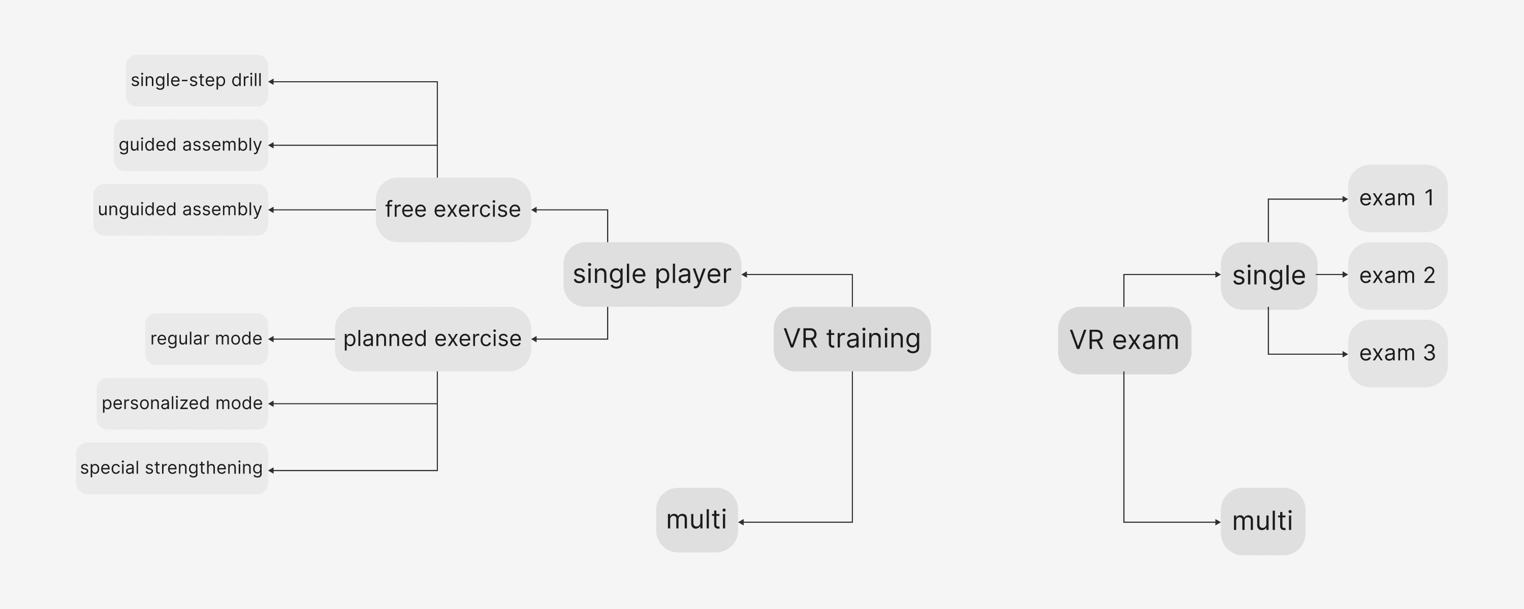
Information Architecture :
I restructured the information architecture to:
Separate Training and Exam content in the top-level navigation
Reduce menu layers from 6 -> 4
Surface key tools within 1 click/tap from the main screen
This created a predictable flow, helping first-time users orient themselves quickly.
Design Evolution :
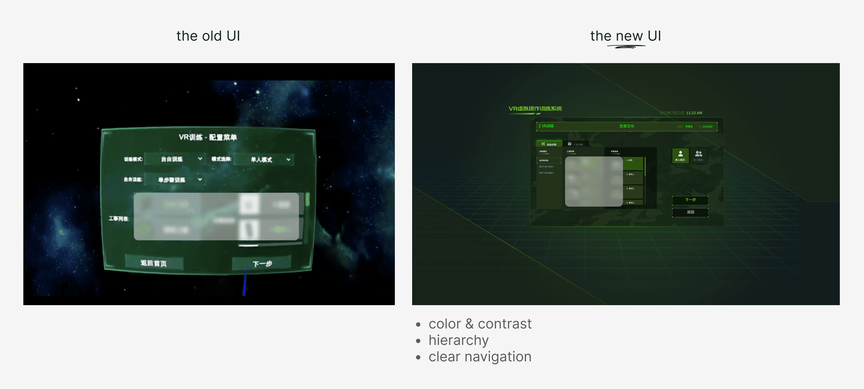
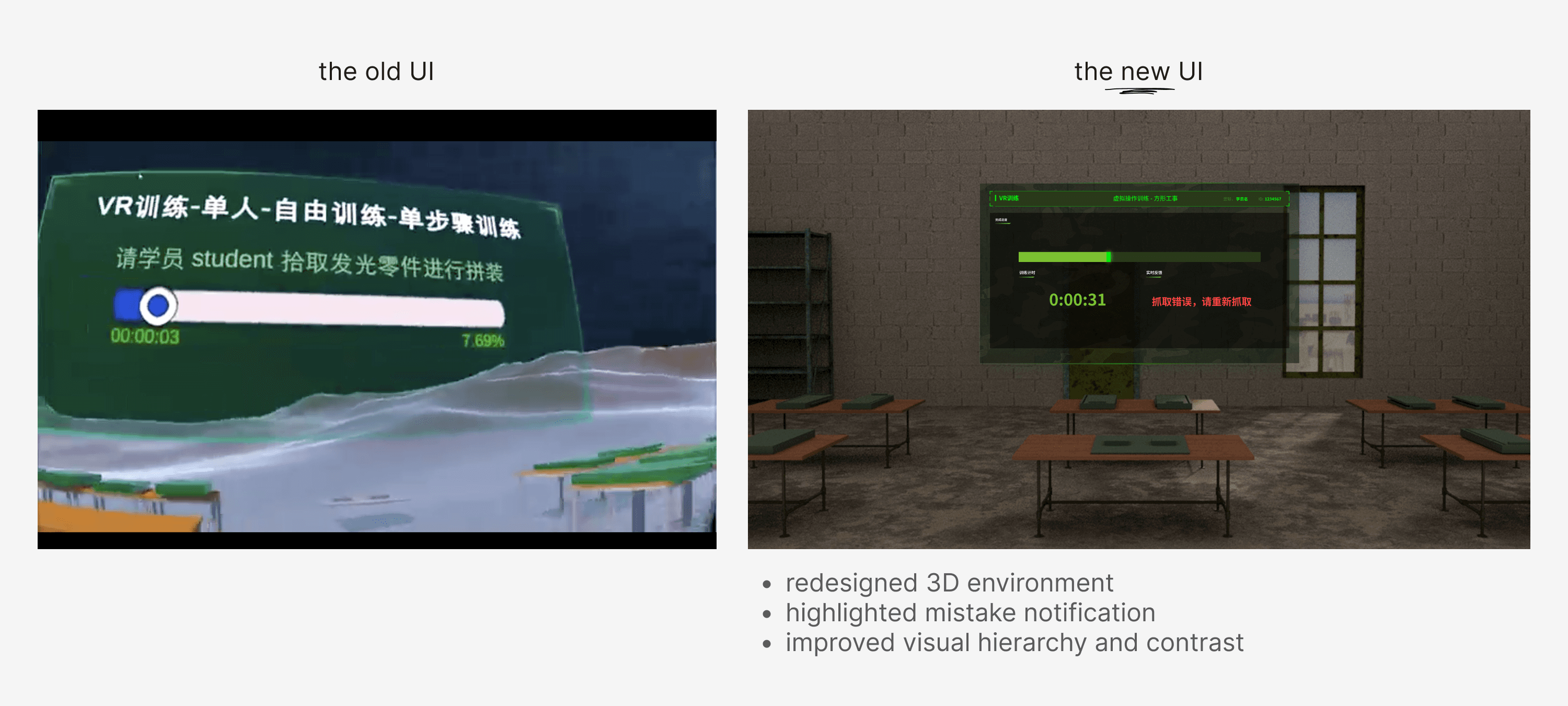
My team rebranded the product to go from Unity's default window UI to a new, coherent style.
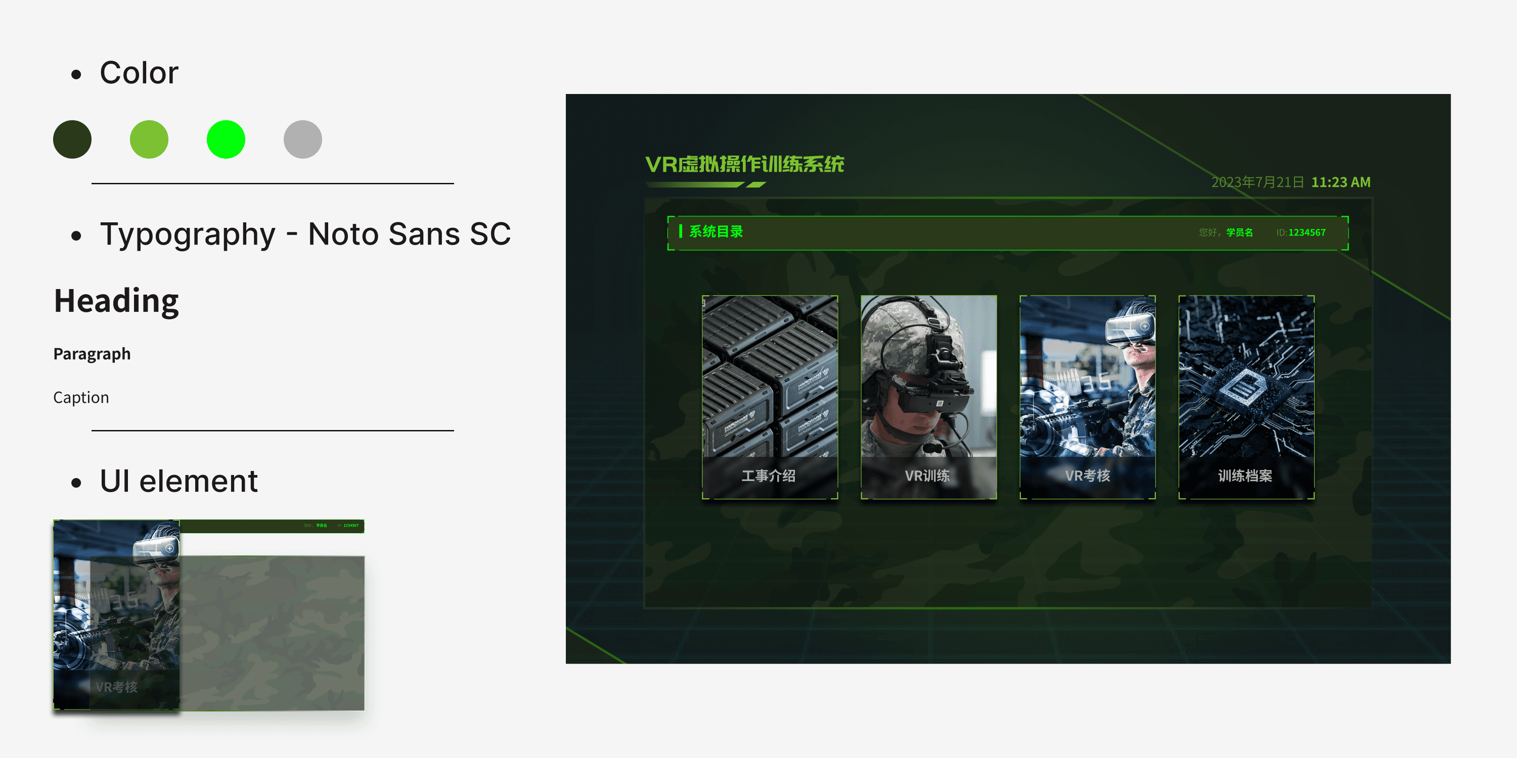
The redesign focused on visual hierarchy and mode distinction:
Color-coded modes: Warm tones for training, cool tones for exam
Clear progress indicators in both modes
Simplified, consistent component sizing and alignment
Spatial grouping of related tools in VR space
I tested low-fidelity wireframes in VR mockups before creating final high-fidelity assets.
Testing & Iteration :
Usability testing:
6 participants from the target user group
Scenarios covered navigation, mode switching, and task execution
Measured time-to-complete and user confidence ratings
Results:
Mode recognition improved from 60% → 100% in testing
Average onboarding time dropped by ~25%
Qualitative feedback: “Feels more like a guided experience than before”

Outcome & Impact :
Final outcome:
Clearer mode separation improved confidence during exams
Faster navigation reduced user frustration
Visual consistency supported a smoother learning curve
The redesign was delivered on time and integrated into the live platform.
What I learned:
Even small changes to the information hierarchy can have a big usability impact
Color and spatial cues in VR are powerful when used consistently
Working within IP constraints requires creative presentation strategies
Sensitive Content Notice :
This project contains proprietary details not publicly shareable.
If you’d like to see the full UI flows, asset library, and interaction videos, please contact me for a private walkthrough under NDA.
VR/AR Design
XR Training System
Interactive VR/AR training system for hands-on assembly skills.
Year :
2023
Role :
UX/3D Designer
Tool :
Figma, Maya
Project Duration :
3 months
Impact :
I redesigned an XR training system used in high-stakes technical environments, improving clarity between training and exam modes and streamlining the onboarding process.
CONTEXT & PROBLEM :
Across industries, there's a growing demand for practical assembly skills, yet limited opportunities for hands-on training. Our goal was to build a system that transforms static learning into experiential, repeatable practice—accessible anytime, anywhere.
The XR training platform was designed to help trainees learn complex procedures through immersive VR and AR environments.
However, user feedback and test results revealed three critical issues shown below.
Challenge: Redesign the system to be intuitive for first-time users, while preserving advanced functionality for experienced operators.
Constraints:
Project timeline: 3 months
Proprietary product: limited visual disclosure without NDA
Multi-platform design: VR headset + desktop
My Role & Responsibilities :
My role: UX designer, 3D modeler, 3D animator
Team: 1 product manager, 4 developers (Unity), 1 QA lead, 1 subject matter expert, 4 designers
My contributions:
Led the VR section end-to-end UX process, from research to delivery
Created information architecture maps
Designed VR UI layouts and interaction flows
Modeled & optimized 3D assets for real-time performance
Collaborated closely with Unity developers for implementation
Research & Discovery :
Methods:
Reviewed existing UI and recorded usage sessions
Conducted 5 user interviews with trainees and instructors
Mapped pain points to specific UI components
Key insights:
Users couldn’t always tell when they were in exam mode → anxiety + mistakes
Navigation menus required too many steps for common actions
The training content felt “buried” — too much visual noise
These findings guided the redesign priorities.
Information Architecture :
I restructured the information architecture to:
Separate Training and Exam content in the top-level navigation
Reduce menu layers from 6 -> 4
Surface key tools within 1 click/tap from the main screen
This created a predictable flow, helping first-time users orient themselves quickly.
Design Evolution :
My team rebranded the product to go from Unity's default window UI to a new, coherent style.
The redesign focused on visual hierarchy and mode distinction:
Color-coded modes: Warm tones for training, cool tones for exam
Clear progress indicators in both modes
Simplified, consistent component sizing and alignment
Spatial grouping of related tools in VR space
I tested low-fidelity wireframes in VR mockups before creating final high-fidelity assets.
Testing & Iteration :
Usability testing:
6 participants from the target user group
Scenarios covered navigation, mode switching, and task execution
Measured time-to-complete and user confidence ratings
Results:
Mode recognition improved from 60% → 100% in testing
Average onboarding time dropped by ~25%
Qualitative feedback: “Feels more like a guided experience than before”
Outcome & Impact :
Final outcome:
Clearer mode separation improved confidence during exams
Faster navigation reduced user frustration
Visual consistency supported a smoother learning curve
The redesign was delivered on time and integrated into the live platform.
What I learned:
Even small changes to the information hierarchy can have a big usability impact
Color and spatial cues in VR are powerful when used consistently
Working within IP constraints requires creative presentation strategies
Sensitive Content Notice :
This project contains proprietary details not publicly shareable.
If you’d like to see the full UI flows, asset library, and interaction videos, please contact me for a private walkthrough under NDA.